
Three Examples of Identifying Rural Regions

This is the second part of a two-part article about determining the rural character of any given region and therefore, its derivative suitability as a retreat location for prepper purposes.
If you arrived here direct from another site’s link or search engine, we’d recommend you first read the first part – How Rural is Your Retreat’s Region – and then come back here to read this second part.
The Index of Relative Rurality
In 2006, a researcher from Purdue University, IN, (Brigitte Waldorf) published a paper in which she detailed a measure she called the Index of Relative Rurality (abbreviated IRR) – a scale from 0.0 to 1.0 for measuring areas, with 0.0 being most urban to 1.0 being most rural. At the time, this was an innovative new measure, and used four factors for giving a rating – population size, population density, percentage of urban residents (ie living in built up areas), and distance to the closest metropolitan area.
But it also has some major limitations. Although its author opens her introduction by saying (and we agree with her)
Low population density, abundance of farmland, and remoteness from urban agglomerations are characteristics that people typically associate with rural places.
the problem is that her IRR scale, while considering the first and the third of the three factors, completely overlooks the second – ie, the land use in the region being measured. We think this is an important additional factor. She disagrees, saying on page 9
Are there additional dimensions or rurality? In the past, it may have been defendable to include the reliance on agriculture as a key dimension. However, today agriculture accounts for such a small share of economic activities overall as well as in rural areas, that it no longer qualifies as a key dimension. Similarly, many social characteristics (e.g., traditional) often associated with rural areas are —at best—outcomes but not defining dimensions of rurality.
That’s a very sad statement to make, isn’t it, and vividly and unintentionally ‘proves’ one of our key contentions – that our society is becoming unsustainably unbalanced in favor of cities. Maybe, for her purposes (and she goes on to confess she chose simple measures with readily available data) it is appropriate to ignore agricultural issues, but for our purposes, we feel it is an essential consideration. And, indeed, we’d have hoped that a woman based in Indiana would be more in tune with rural issues – apparently not.
Nonetheless, in the seven years since the IRR was published, there has been little work published to enhance it or to incorporate considerations about land use/lifestyle.
Another weakness of her scoring is that the author attributes equal importance to all four factors, apparently again for the sake of mathematical simplicity rather than due to any reasoned decision that they all apply equally. If she adjusted the weighting for the four factors, or the scoring within each factor, the aggregate ratings would then change appreciably.
But, while recognizing the limitations of the Index of Relative Rurality, let’s at least look at what it shows.
Here’s a map, based on the 2000 census, showing, county by county across the nation, its IRR score.
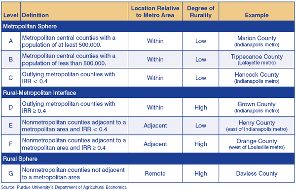
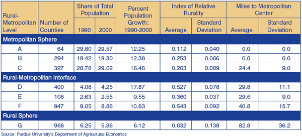
In a follow-up article in 2007, the researcher points out an interesting additional measurement – a seven step series of levels of rural-metropolitan characterization of counties. A map, again using 2000 census data, is here. For our interests, we’d most prefer counties in the E, F, or G categories (defined here and detailed here.).
Here’s a link to her article where she presents this additional material.
Agricultural and Farming Issues
Although ignored by Professor Waldorf who claimed it to be irrelevant and who also implied it to be inconvenient to measure, we consider that the land use within a region is a vital measure of its suitability for a ‘grid down’ type retreat.
Unproductive land may be fine for recreational purposes, and may offer a lovely lifestyle when food, energy, and everything else is readily available and inexpensive. But if (when?) our elaborate social support systems should collapse, it is essential that we can become independent and self-contained, able to produce our own food, our own energy, and survive with a minimum of external inputs.
So how can we now evaluate agricultural/productive land use? Happily, and notwithstanding Professor Waldorf’s claim that such data was difficult to obtain, the USDA has some excellent information, in county by county form, and displayed helpfully on maps, dating from its 2007 rural census.
The USDA does these censuses on a five yearly cycle, so we hope the published 2007 data will soon be replaced by 2012 data.
Here’s an excellent map that shows the percentage of area, by county, that is used for farming purposes.
This encapsulates much of what we’d want to know, but it does have a few limitations. For example, it considers farmland as a percentage of all land, and fails to distinguish between land that could theoretically be used for farming and land that could not be so used. So if a county has a large amount of national forest/park on it, then it will be downgraded for farm area utilization, even if the remaining balance of the county is 100% farmland.
A slightly different representation of this data is on this map, showing acres of land in farms. The more intense the blue dotting, the greater the abundance of farming.
You might also be interested to know the average size of each farm, and whether it is privately or corporately owned. For our purposes, we might assume that we’d be more comfortable in an area of farms of similar size to whatever we would hope to own, ourselves, and we’d prefer to be among other privately owned farms than among those owned by abstract/remote corporations. We also have a perception that smaller farms may be less reliant on high levels of automation and, as such, better able to transition to less energy intensive farming methods.
An interesting consideration is if the number of farms is increasing or decreasing. Overall, the total count of farms increased in the five years from 2002 to 2007. You’d probably prefer to be in a region with stable or increasing farms, rather than in an area with decreasing farms – these regions are probably suffering from encroaching urbanization.
An alternate view is here, which shows the change in number of acres being farmed. A decrease in the number of farms, or an increase for that matter, might be due to one farm being split into two, or two farms merged into one, so the change in total number of acres being farmed is in some respects more helpful.
It is also helpful to understand what type of farm use applies in an area.
This map shows the percentage of crop type farms as measured against total farmland, and this map shows percentage of pastureland as measured against total farmland.. The two maps are more or less reciprocals or opposites of each other.
If you’d like further details about the type of farming, there are other maps on this page, and at the bottom of the page, links to a massive number more. Here’s just one more of the many other useful insights offered by the USDA that can help you better understand the implications of one region compared to another.
These maps and the data they represent give an interesting and valuable additional perspective on ‘good’ and not so good areas to locate, but are relatively silent on the subject of population densities, so you need to balance the data here with other data, possibly the Index of Relative Rurality (see above), and/or the status of the region as being a frontier region or not, discussed next.
Frontier Communities
Although Dr Hart’s analysis of classification methodologies lists over 30 different ways to distinguish rural from urban, he is clearly interested in the concept of ‘frontier’ regions, although he is quick to point out, as we would too, that the word ‘frontier’ sometimes has irrelevant and unhelpful connotations. We don’t mean frontier in any sort of ‘Davy Crockett’ or warlike sense at all, merely in the sense of being far away from urban living and lifestyles.
There is a National Center for Frontier Communities and they have come up with a three factor calculation for evaluating a region’s frontier status – population density, distance in miles from a market or service area, and travel time in minutes to that same market or service area.
They have asked states and in particular, the State Offices of Rural Health, to define, county by county, which counties they believe to be ‘frontier’ counties. Thirteen states don’t define any of their counties as frontier counties, 19 use the three factor calculation, and 16 use other criteria, so the results are hardly homogenous and consistent.
The results are not very useful for two reasons. First, they are county by county, and secondly, they are either ‘yes’ or ‘no’ rather than on a continuum with varying values. However, you can see them here, and there is also a very interesting derivative map, showing the change in frontier status over the past 20 years. The second map gives a good perspective of where urban sprawl is happening and moving.
In addition to this county-wide categorization, the Center is developing a new definition for ‘frontier’ and has published a draft series of four maps that are massively more valuable.
Firstly, they show varying degrees of frontier qualification, rather than the simplistic yes/no status of their current classification. Secondly, they are more ‘granular’ – they show details down to zip code level rather than no smaller than county level.
You can see their four maps here. In case it isn’t obvious, FAR Level One is a superset that includes all level two, three and four regions too. Each additional level shows less and less frontier regions, and this is very helpful because you can see not only what your immediate area is categorized as, but what the adjoining areas may be as well.
Their definition for FAR Level Four is surprisingly close to something that would almost be suitable for locating a retreat – we’d doubtless prefer greater distances from larger metro areas, so we’d feel more comfortable in the middle of each block of FAR Level Four region.
Summary
This is the second part of a two-part article on how to determine the rural vs urban nature of an area. If you’ve not already done so, we recommend you should read the first part – How Rural is Your Retreat’s Region – too.
We ended the first part by pointing out that identifying an ideal location for a retreat involves both art and science. Now that we’ve looked at three different scientific methodologies, we continue to feel that there’s a measure of art involved, while the science component is much more complex than generally acknowledged.
Most of all, while we’ve looked at some detail into the rural vs urban differentiation in this two-part article, this is only one of very many different factors and considerations you need to consider when choosing your ideal retreat.
Please also see our more general series of articles on choosing and evaluating the best location for your retreat.

Thank you, Dave, for a most informative article and the links to all those maps. I feel a little better about my county, now. we have a large percentage of farmland and an F rating on the rural-metro interface. Though I would prefer to be farther from the big city, I had to stay with commuting distance of the farthest flung suburb, where I work. On the good side, folks fleeing the city by car should be well past us before they run out of gas and start wandering about on foot.
The county seat has a college, which helps the town support more stores and makes shopping more convenient in a rural area. I assume the students will run home to mom and dad in a deep crisis, lowering our population considerably. Any thoughts on that?